
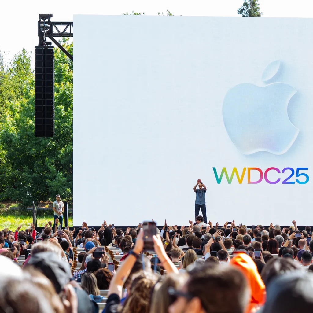
Apple’s WWDC 2025 dropped a visual bombshell: Liquid Glass, a shiny new design for iOS 26, iPadOS 26, macOS Tahoe 26, and the whole Apple gang.
It’s got this slick, translucent vibe—think frosted glass with glowing animations that dance when you tap or tilt your device. It’s gorgeous, no doubt, but as beta testers dig in, there’s a big question: Can Liquid Glass be as inclusive as it is pretty, or is Apple’s latest style move leaving some folks in the dust?
A Dazzling Look with a Catch
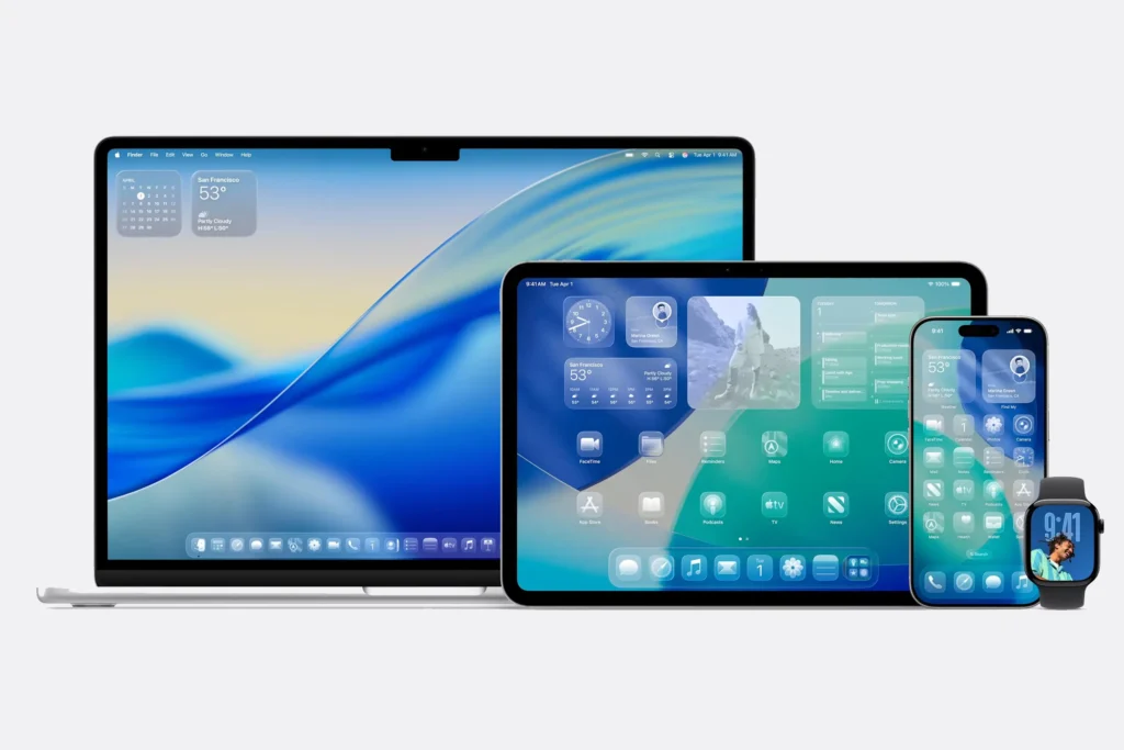
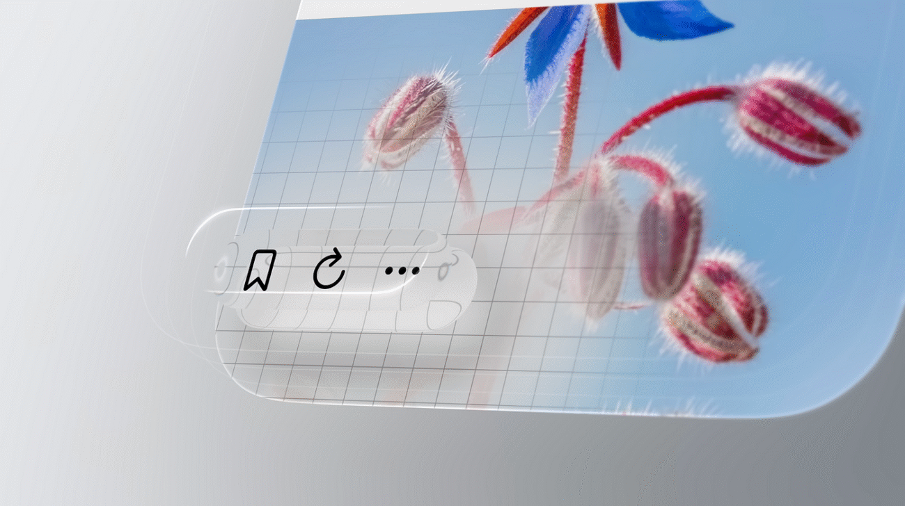
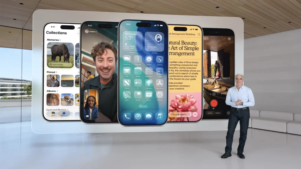
Liquid Glass is Apple’s boldest UI shake-up since iOS 7 ditched leather textures for flat minimalism. It pulls inspiration from visionOS, with stuff like shrinking tab bars, a lock screen clock that morphs to fit your wallpaper, and sidebars that refract light like a prism.
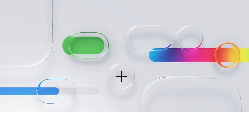
Apple’s calling it “expressive, delightful, and familiar,” and honestly, it feels like you’re holding a futuristic jewel.
But early buzz on X tells a different story. Some users are wearing the hyped- shirt, saying it’s “magical,” while others -grumbles about the Control Center, where layered glass effects make buttons and text a blurry mess against colorful backgrounds. Well—pretty doesn’t always mean practical.
Accessibility: Where Beauty Meets Barriers
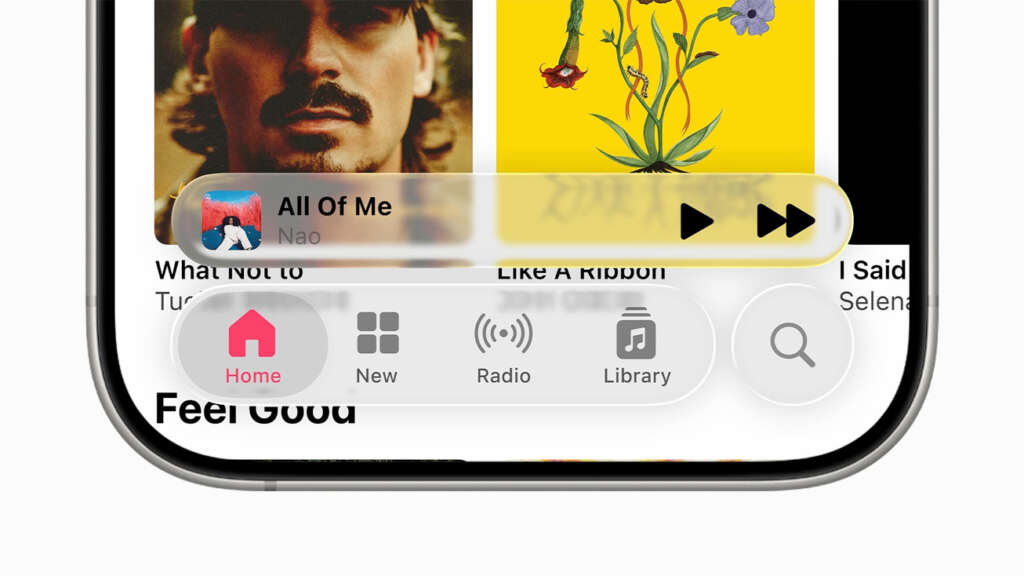
For folks with visual impairments, Liquid Glass’s translucent layers are more than a style quirk—they’re a potential dealbreaker. Low-contrast text and overlapping effects can be tough to read, especially in bright light or for users with low vision.
On X, some testers are already calling it out, saying notifications and menus feel cluttered. Accessibility advocate Steven Aquino, who’s chatted with Apple’s team, gives them props for trying. Apple’s baked in a “Reduce Transparency” toggle that slaps solid backgrounds on those glassy layers, making things clearer. Plus, their Human Interface Guidelines push developers to use high-contrast fallbacks.
But here’s the rub: Why should users have to tweak settings to make a flagship design work? If Liquid Glass is Apple’s big vision, shouldn’t it be accessible out of the box?
Room to Grow Before Fall
Here’s the good news: Liquid Glass is still in beta, and Apple’s got time to iron out the kinks before its fall 2025 rollout. They’ve been here before—remember iOS 7’s super-thin fonts that got beefed up after complaints?
There’s hope Apple could crank up the frost effect or boost contrast to make things easier on the eyes. Some X users are already tossing out ideas, like tweaking the glass blur to cut down on visual noise. Others, though, aren’t holding back, joking that Liquid Glass feels like “Windows Vista’s Aero had a glow-up.” – A Sheldon Cooper “ZING”
Can Apple Nail the Balance?
Apple’s got a rep for setting design trends, and Liquid Glass could be a game-changer, especially as it ties their ecosystem together for future tech like AR glasses. But if it’s going to shine for everyone, accessibility can’t be an afterthought!
Aquino’s cautiously optimistic, saying the design’s potential is huge but needs polish. With a few tweaks—like stronger contrast or less overlap—Liquid Glass could be a win for both style and substance.
So, what’s the verdict? Can Apple make this dazzling design work for all of us, or will its glossy charm leave some users squinting? Only time—and maybe a few beta updates—will tell.
Leave a Comment